Complete revision of a successful design template
Complete revision of a successful design template
by Daniel FleschCreating new design templates is a constant challenge for us. In which direction do current trends tend to go? What needs do our customer groups, the small business owners, have? Where can and may we be innovative, where do we need to attract the broadest possible user group?
Through our many hundreds of thousands of users we receive extensive feedback - also on existing design templates and their potential for improvement. This gives us the opportunity to create new templates based on suggestions for improvement of existing templates. This is what happened with design template 79, which now shines in new splendor as 79_2, completely revised.
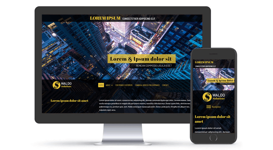
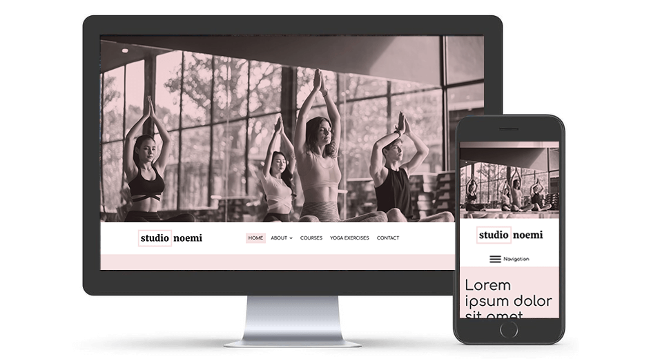
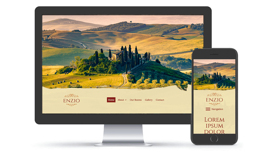
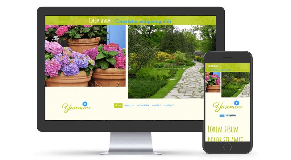
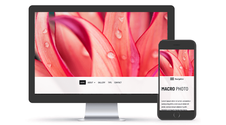
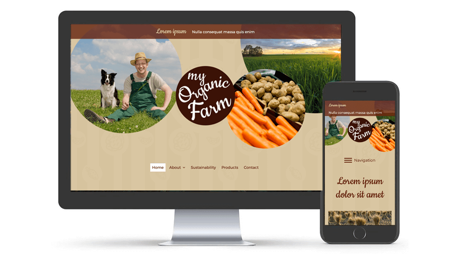
The biggest customer request here was to revise the "Above the Fold" section. The term originates from the printing industry and refers to the area of a newspaper that a reader sees first when folded. With websites, this is the area that is visible to users at first glance without having to scroll. At the same time, however, the content displayed should encourage users to open or scroll.
What has been changed in the template?
Title and subtitle are now on the cover image, the text on the Hero image can enhance the effect / properties of the image. (By the way, good images convey information up to 60,000 times faster than text and are more likely to be remembered: blog.hubspot.com/blog/tabid/6307/bid/33423/19-Reasons-You-Should-Include-Visual-Content-in-Your-Marketing-Data.aspx)
The Hero image area has been enlarged and corresponds to current web trends.
Navigation with a more modern look and improved usability by increasing the spacing.
New animation effects (transitions) when opening the sub navigation.
Introduction of sticky-navigation, i.e. the navigation remains visibly "stuck" at the top of the browser window when scrolling and improves usability.
An enlarged logo area offers more space for the customer logo, which also remains in the visitor's field of vision thanks to "Sticky Navigation".
The content area has been widened and offers more space for texts, images and widgets, as there are no longer side bars next to it. The template is now especially suitable for websites with a lot of content / images or online shops.
The vertical sidebar areas, previously located next to the content area, have been removed; instead, two new, wider sidebar areas have been positioned horizontally below the content area.
The footer area has been implemented as a "sticky footer", so that the content always fills the screen. (see STICKY FOOTER ARTICLE)
The new layout "79_02" offers an overall more modern appearance, improved usability and more design options. Users of layout "79" and all other templates can switch to the new design at any time.
Feedback from our users is always welcome!
 Daniel
Flesch
Daniel
Flesch